Dean Park
The Brief
In collaboration with an interior architecture designer, Sophia Lori, I was tasted to create the wayfinding in Dean Park, based on the interior plans given to me Sophia.
The wayfinding I created needed to be inclusive and accessible for everyone, this is something I researched before creating my wayfinding and I took into consideration when designing. I also had to consider how to create sustainable designs when designing this wayfinding system.
Creating Flat Plans
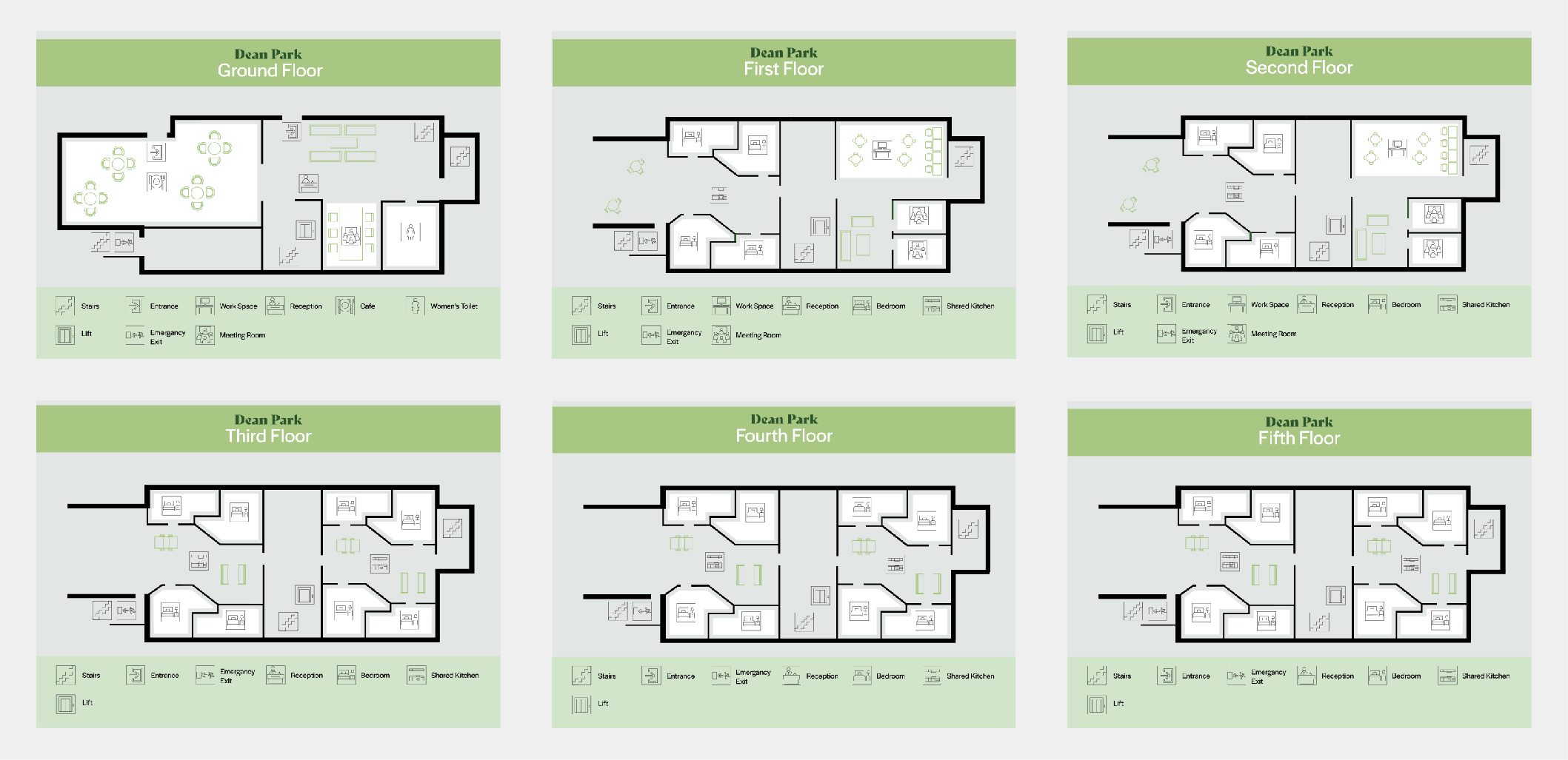
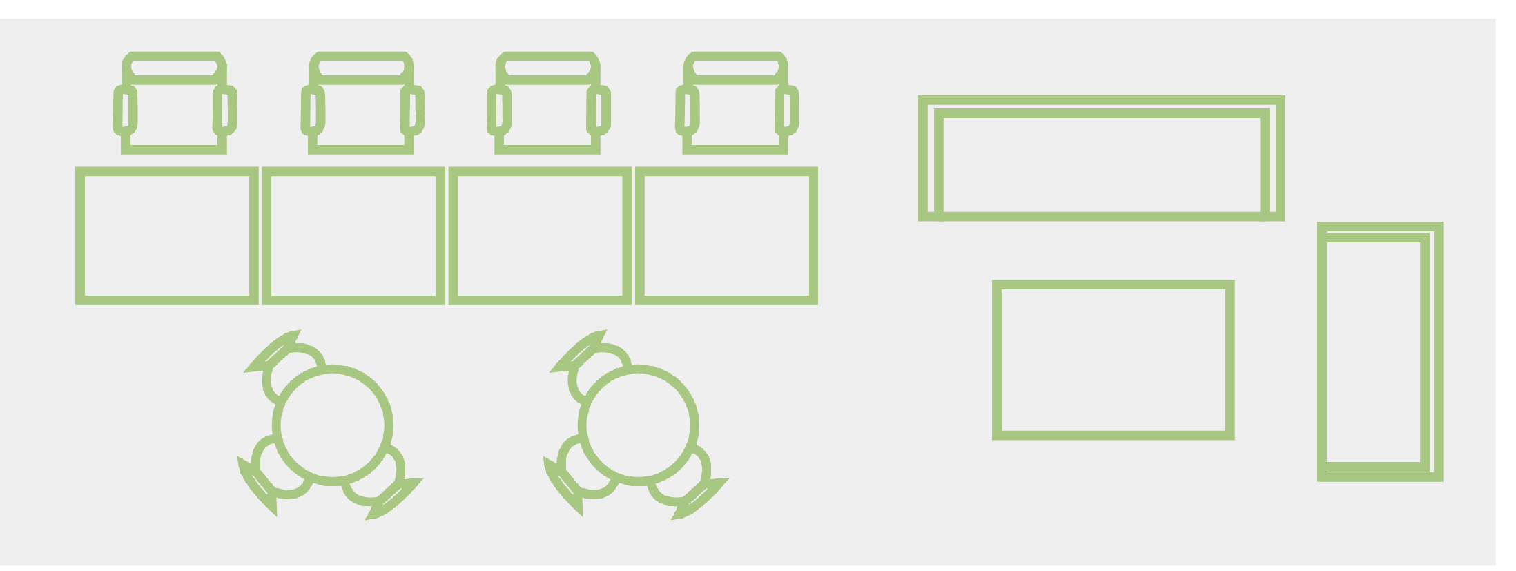
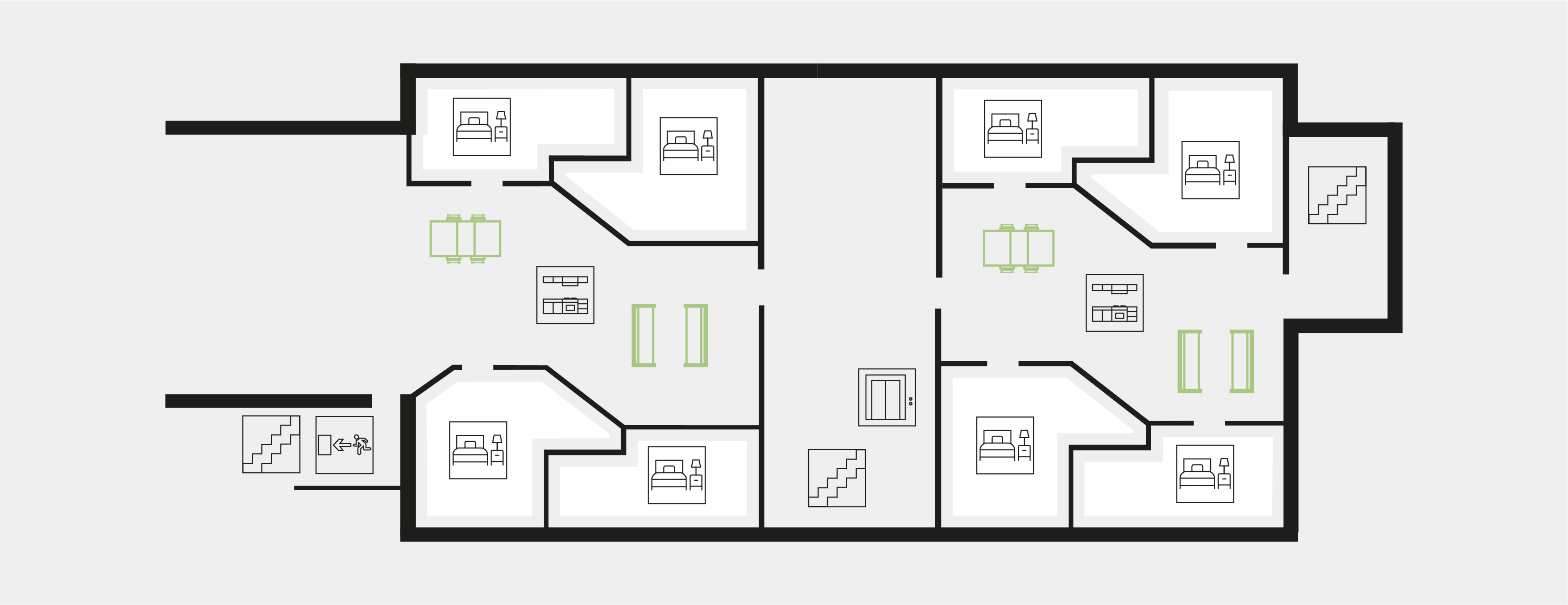
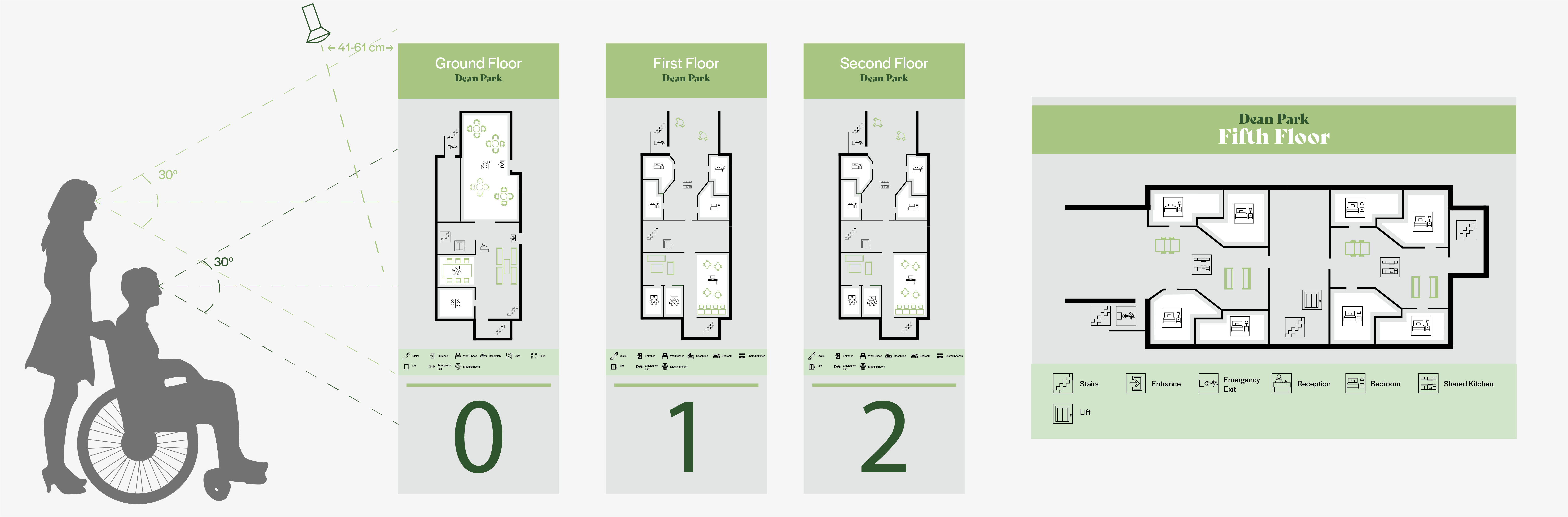
After researching wayfinding online and using it myself I really liked the idea of illustrating flat plans and creating a readable map of each floor on the building. Sophia gave me 6 floors of flat plans, using illustrator and our colour pallet I translated the flat plans she gave me into legible flat plans for the public to follow. I used the icons I created, and I created sofas and chairs to show where the social areas are. The icons I created worked well on the flat plans.
Icons and Patterns
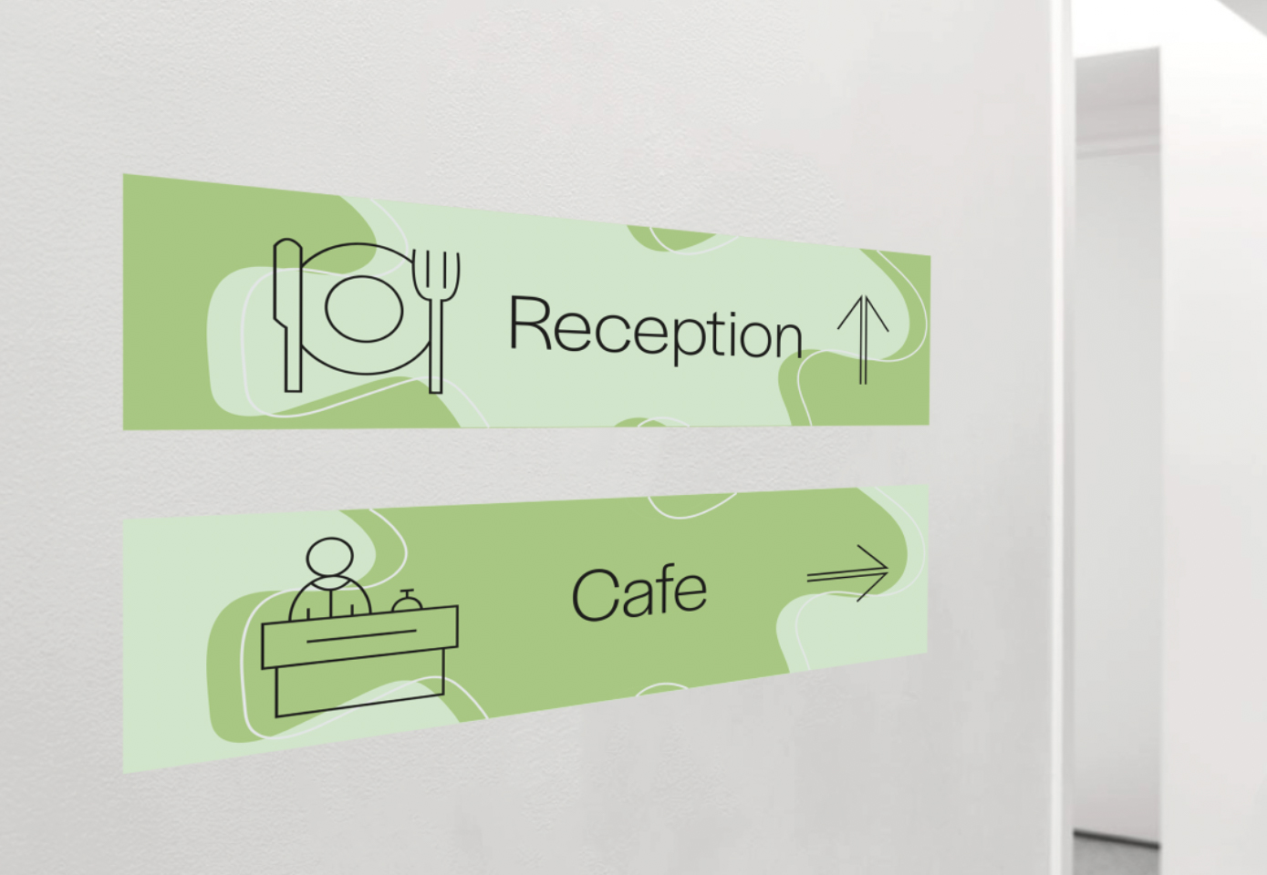
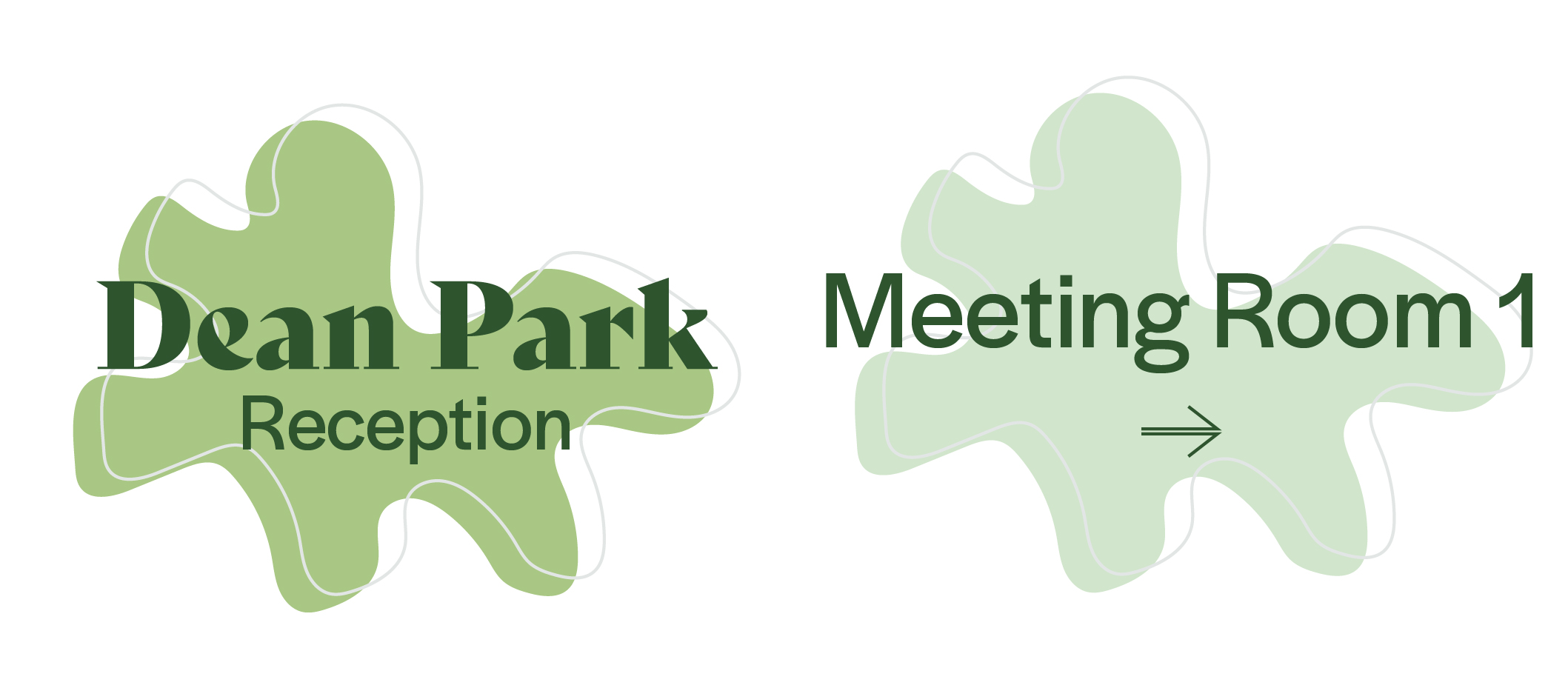
Using the information Sophia gave me I created these icons based off the areas I felt were most important to the users of dean park. Using the flat plans, I zoned out areas and used these to create my icons. I wanted the icons to look fun as the residents will see them all over the building and be recognisable enough to not need to use the key and quickly navigate your way around the building.
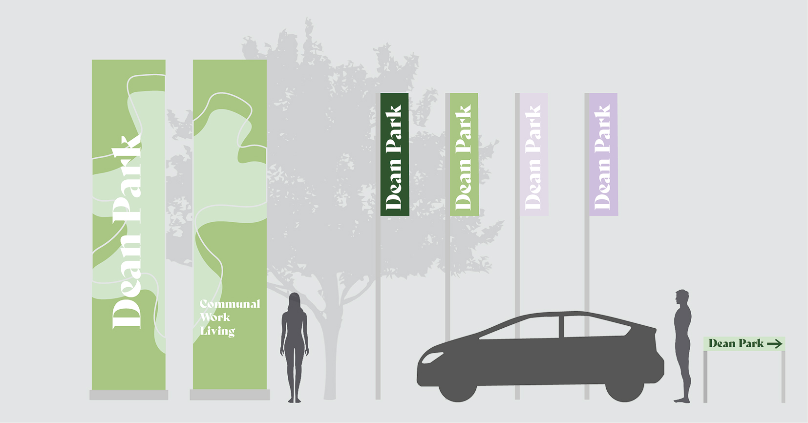
Outdoor Signage
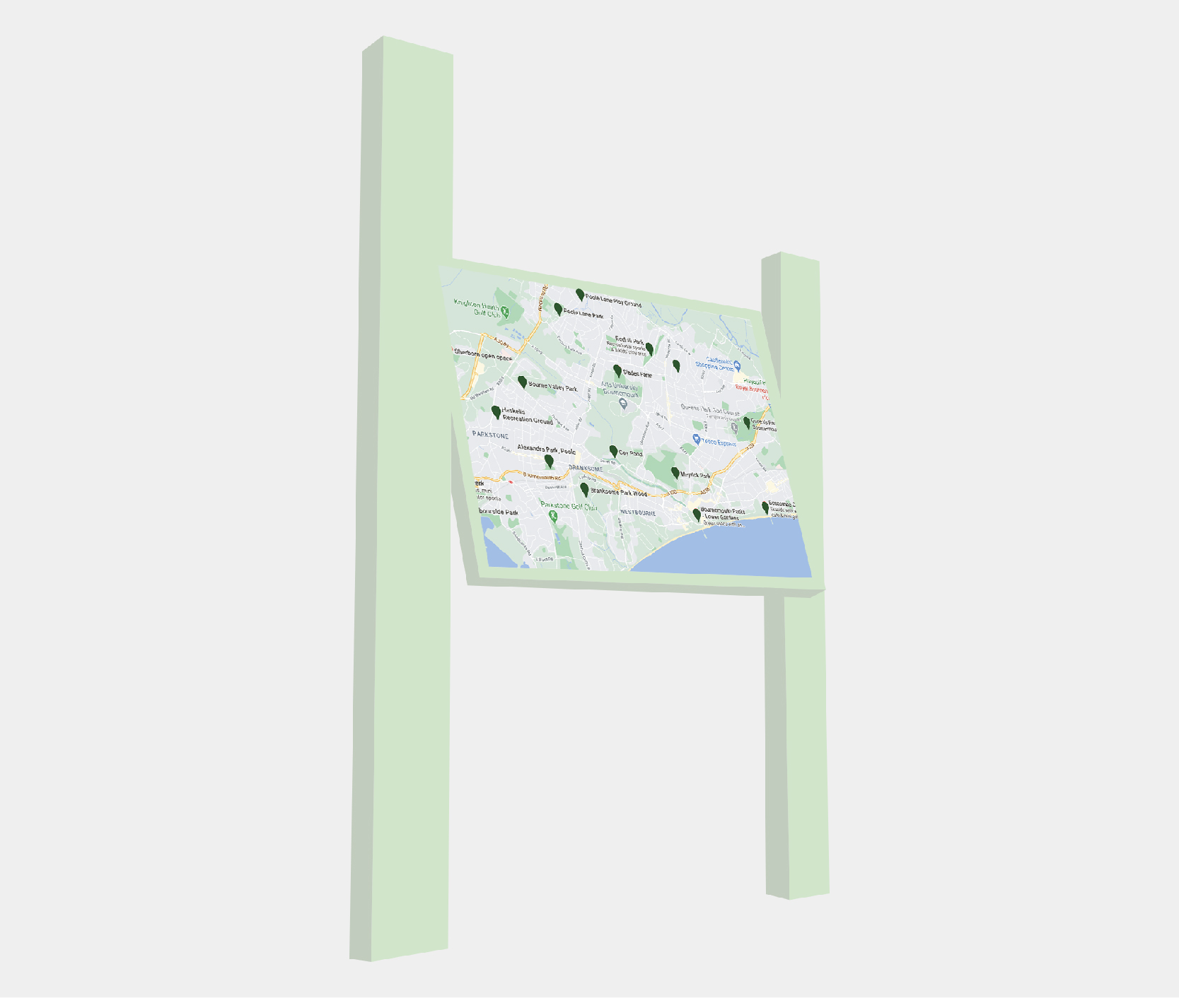
As dean park is tucked away and not too visible when on the road, when designing the wayfinding outdoors I wanted to create a memorable landmark to mark the location. I created the two large boards, made of storm board, with the name on to clearly mark to building to people in cars and pedestrians. I also wanted to include some flags with the name of dean park on to further point out the building, using the same font for the name created a brand like identity for the visual system of the building.
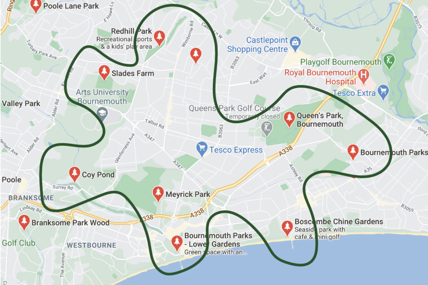
I also created a smaller sign for Dean Park using the same colour scheme. Playing on the name ‘dean park’ I created a map of the sounding Bournemouth area marking all the green spaces in the area. I created this with the digital nomads in mind, knowing they would be looking at screens all day I thought this would encourage outdoors time. the board can also be tiled down so accessible for wheelchair users.
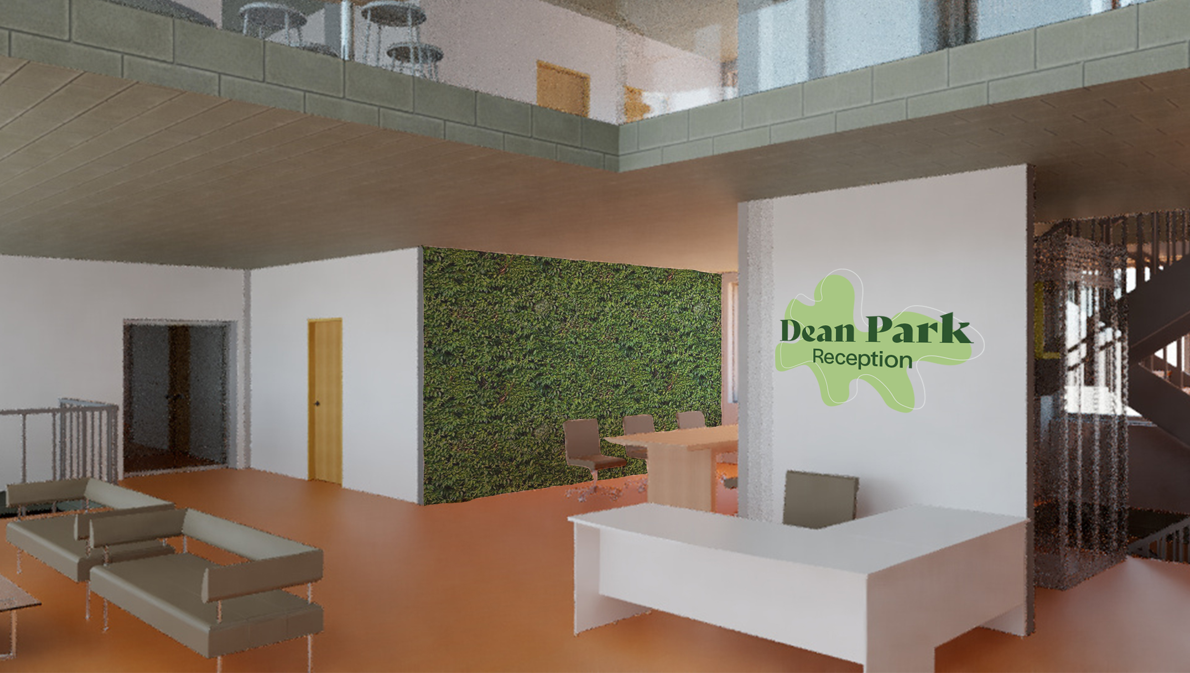
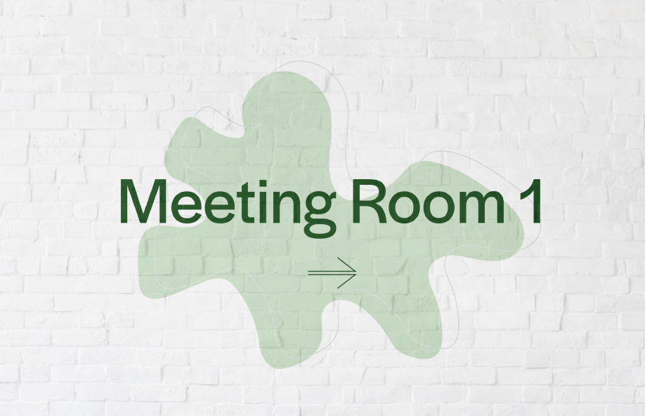
Indoor signage
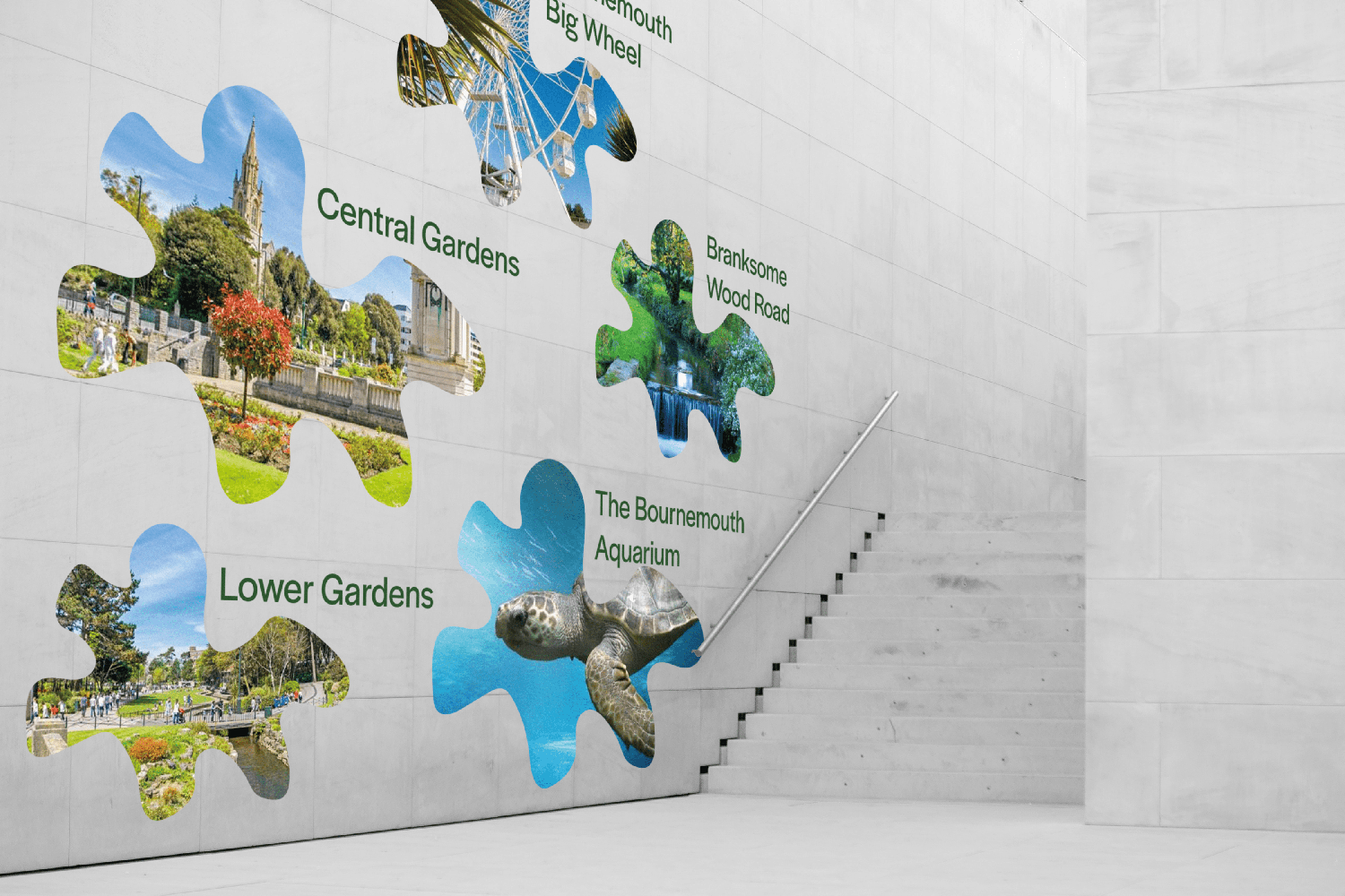
Using my pattern created from the shapes of the green spaces in Bournemouth, my colour scheme, fonts and icons; I created this indoors visual wayfinding system.
I created these large murals to be indoor landmarks so residents can use these memorable locations to help their wayfinding journey around the building. The organic shapes and colours were used to juxtapose against the harsh screens and colours they see every day as digital nomads.
Sustainability
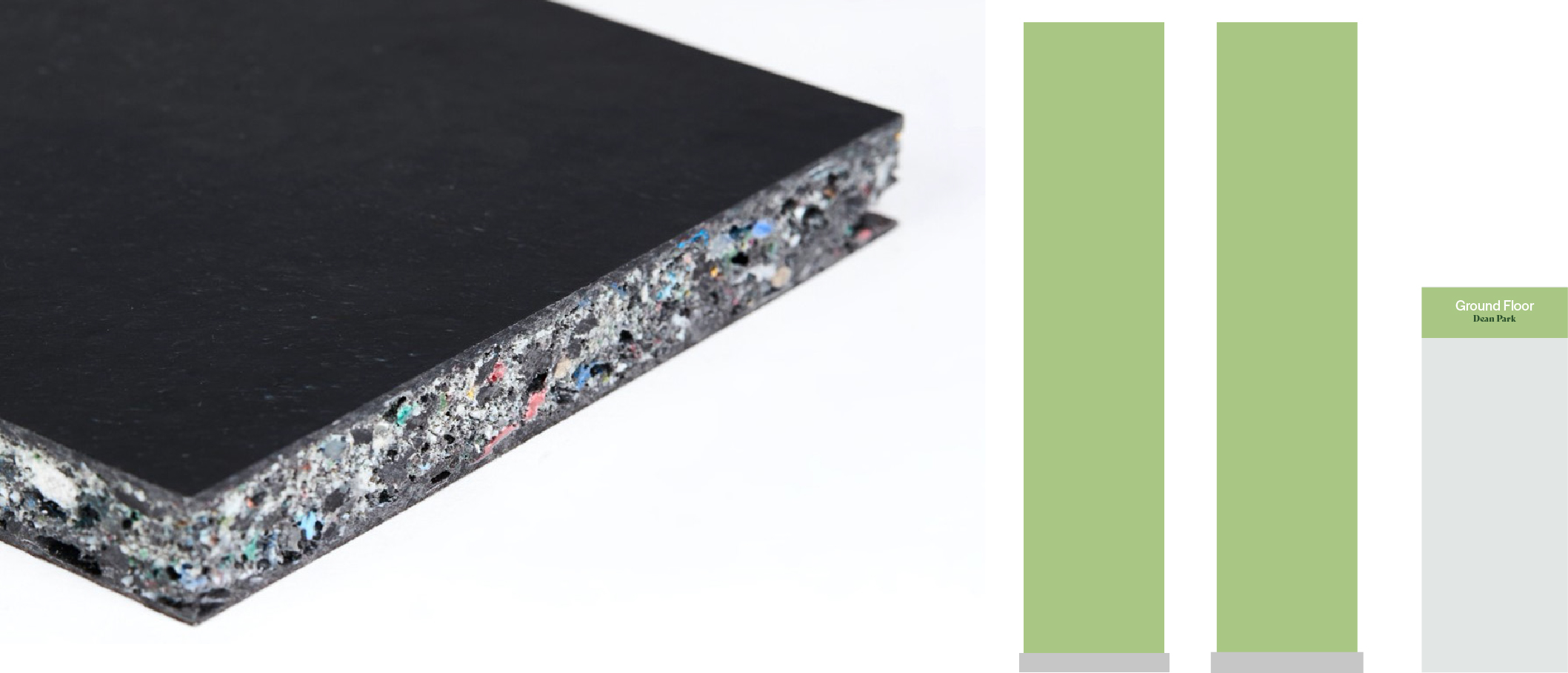
Storm Board: In Sophia’s presentation she highlighted the importance sustainability had when considering her designs. This was something I was keen to translate into my work too. When designing way finding boards, I looked into using storm board to create them. Storm board is a weatherproof malleable marital. It is made from broken down recycled plastics. Due to is strength it can be recycled down and broken up to be made into more new boards when finished with. These storm boards are a great alternative to hard single use plastics or paper which will have to be replaced.
Primary Research
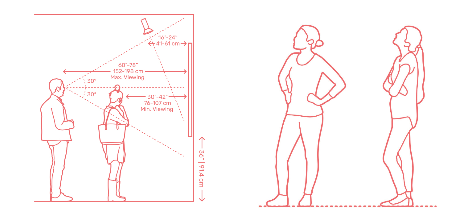
Dimensions: I felt it was essential to research into how tall to make my way finding boards and signs so they would be clearly legible for all users espically people who use a wheel chair. Dimensions was a great source of information explaining how our vision is best at a 30° angle. I kept this in mind when creating my boards with smaller icons and information on to create the most inclusive design possible.
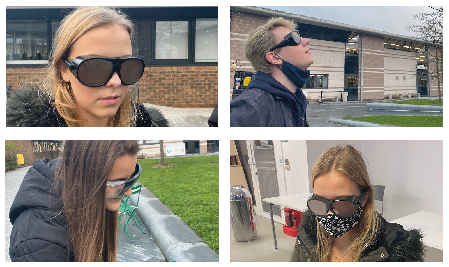
Visual Imparments: I also wanted to make my work inclusive for people with visual impairments. I began my research by using glasses that stimulate having a visual impairment such as glaucoma and partial blindness. After wearing these glasses and looking at way finding on the AUB campus it was clear how important light and touch is when creating way finding for the visually impaired is. This was something I wanted to consider when created the way finding for the users at Dean Park.
Secondary Research
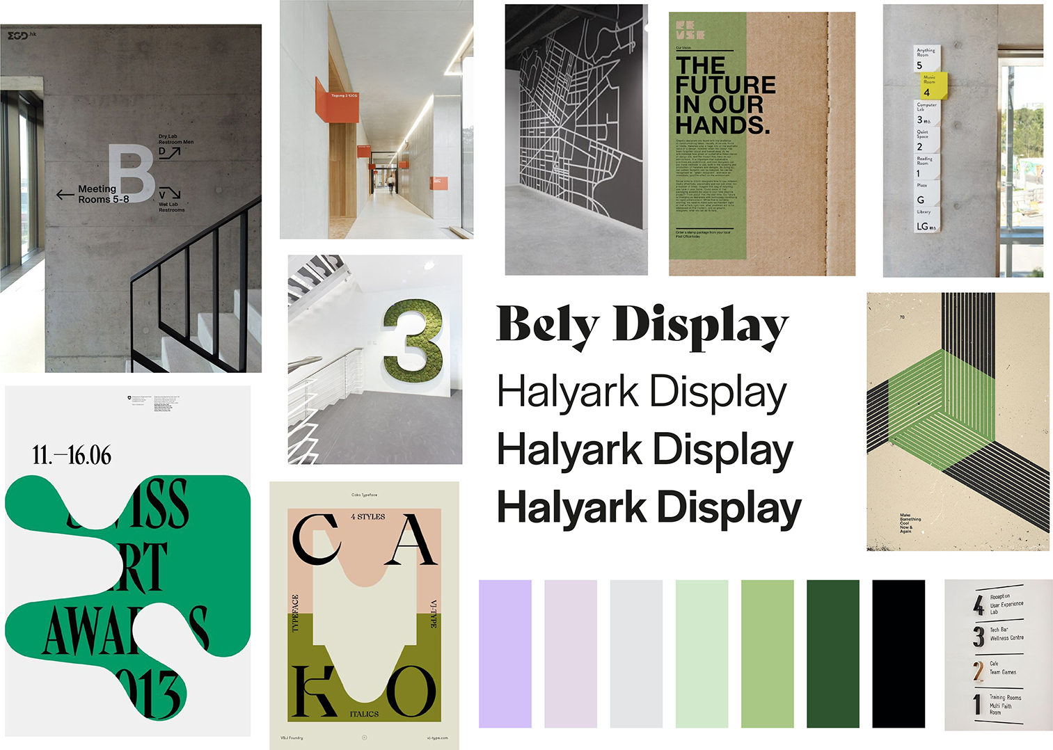
After collected Sophia’s work I started to research into wayfinding and created a visual system in a building. I began by creating a board in Pinterest and pinning visual systems I found interesting and wanted to experiment with. This helped me understand clearly what way finding really is. I then created a mood board using images and colours I liked the look of. This created a coherent feel throughout my work.
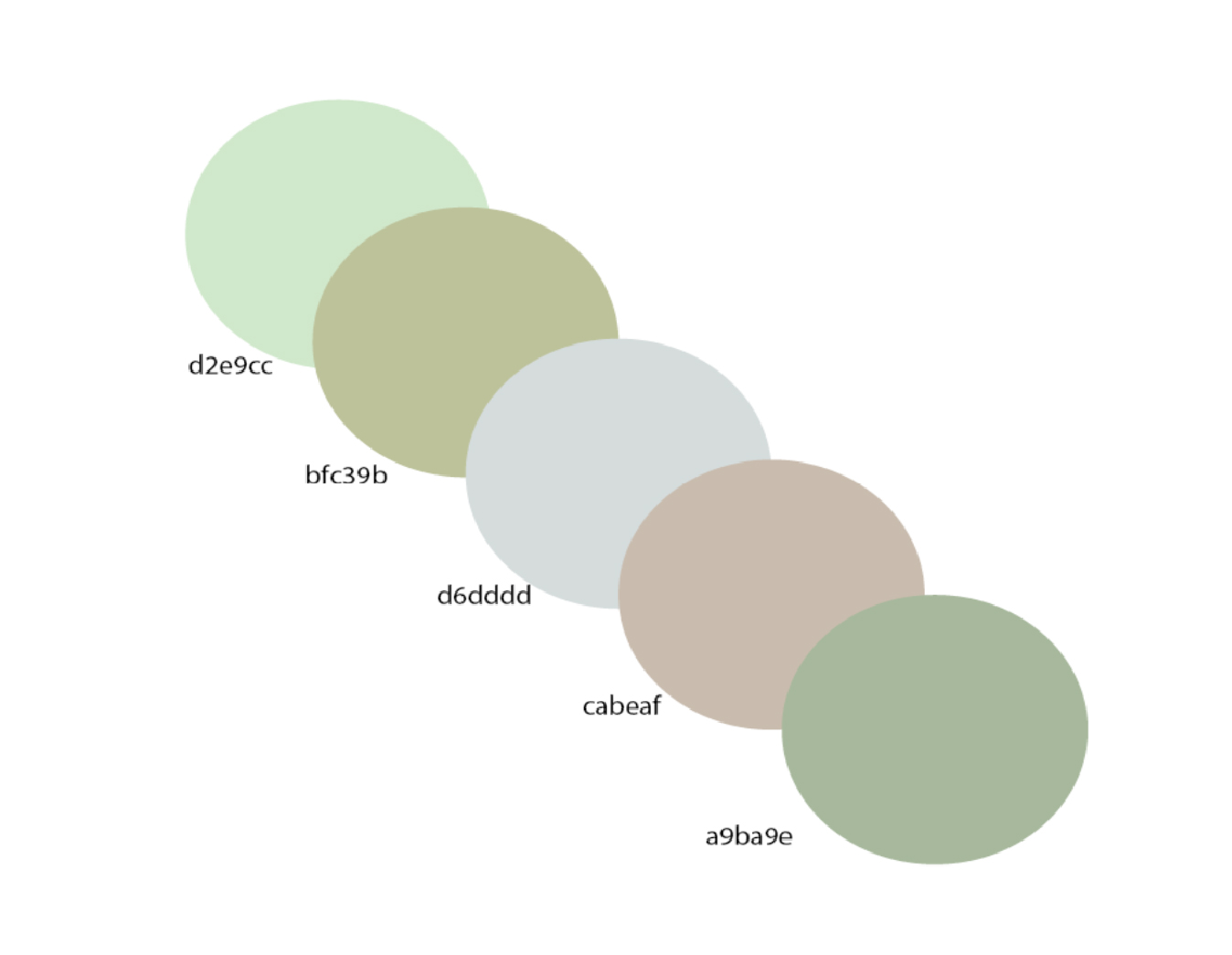
When creating a colour pallet, I asked Sophia if she had any colours in mind or any pallets she used when creating the interior. Sophia sent me her colour pallet explaining she wanted ‘natural’ and ‘clean’ colours. I then elaborated from her pallet and created a complementary pallet using natural greens and complementary purples.When picking font, I chose the decorative font ‘Bely’. This font was perfect in creating a fun look to the way finding, it was used when writing the name of the building creating a brand like feel. For the body text in the building, I chose ‘Halyark’.
See more Projects:
Website Creation